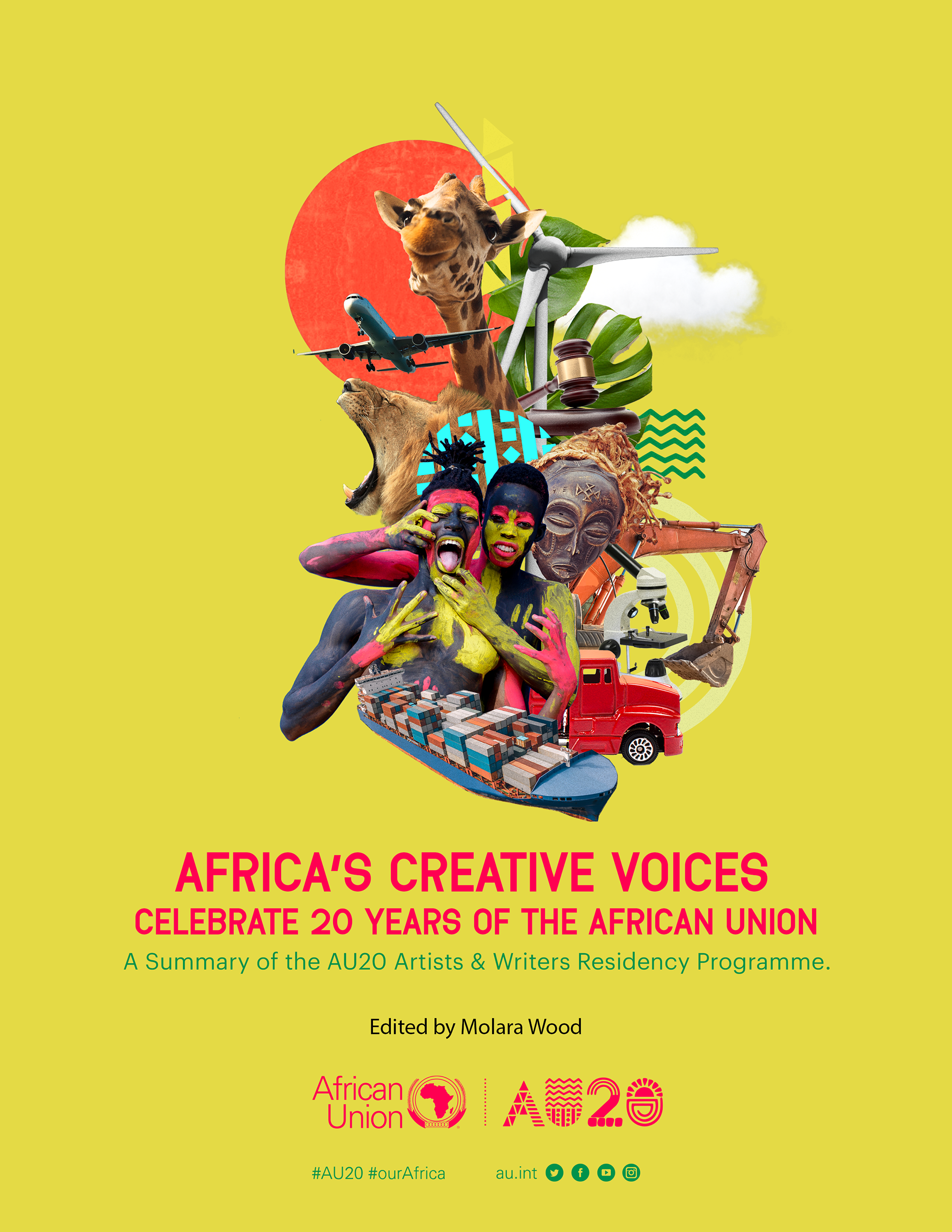
When the African Union turned 20, my good friends at Africa No Filter reached out and asked me to design the layout for a magazine celebrating two decades of the AU’s impact. Given my deep love for collage art, I took the opportunity to create a striking cover design that visually encapsulates Africa’s journey and progress.
For the color palette, I used gold/yellow, symbolizing the African sun and the rich minerals we possess—a nod to both our natural wealth and the continent’s resilience. The composition brings together multiple elements, each representing a key facet of Africa’s growth and potential:
A ship and a truck – Representing trade, both internationally and within the continent, with a focus on the African Continental Free Trade Area (AfCFTA) and the movement of goods and services across borders.
A microscope – Signifying Africa’s leadership in medical advancements, including pioneering efforts in disease elimination and public health innovation.
Leaves and farming equipment – A tribute to agriculture, a backbone of many African economies, and the innovation driving sustainable food production.
A windmill – Representing Africa’s shift toward renewable energy, a crucial step in combating climate change and ensuring energy security.
An airplane in flight – Symbolizing enhanced transportation and connectivity within Africa, as many countries work towards visa-free travel for fellow Africans, fostering stronger regional ties.
An African mask and people – Emphasizing our rich, thriving cultures, heritage, and the resilience of African identities.
Wildlife – A reflection of our iconic savannahs and diverse ecosystems, home to some of the world’s most unique and majestic animals.
This piece was a labor of love, a visual celebration of Africa’s past, present, and future—a continent that is bold, innovative, and continuously evolving.
These were the alternative cover designs I explored, each capturing a different perspective on Africa’s journey over the past 20 years. While the final cover encapsulated trade, culture, innovation, and natural wealth, these other versions brought unique visual narratives to the table.
Each option carried its own symbolism, experimenting with different compositions, color schemes, and elements to highlight Africa’s economic growth, cultural vibrancy, and global influence. Some versions emphasized heritage and resilience, all while maintaining a strong collage aesthetic that ties together Africa’s past, present, and future.
The selected cover best represented the core themes of unity, progress, and vision that define the African Union’s 20-year journey.
I truly enjoyed working on the artwork for the publication, especially the opportunity to play with bright, bold colors that reflect Africa’s vibrancy and energy. The process allowed me to merge collage, symbolism, and storytelling, creating visuals that not only celebrated the African Union’s 20-year journey but also highlighted the continent’s resilience, culture, and progress.
Bringing together different elements, textures, and color contrasts made the artwork come alive, and it was exciting to experiment with layouts and visual narratives that honored Africa’s past while looking toward its future.
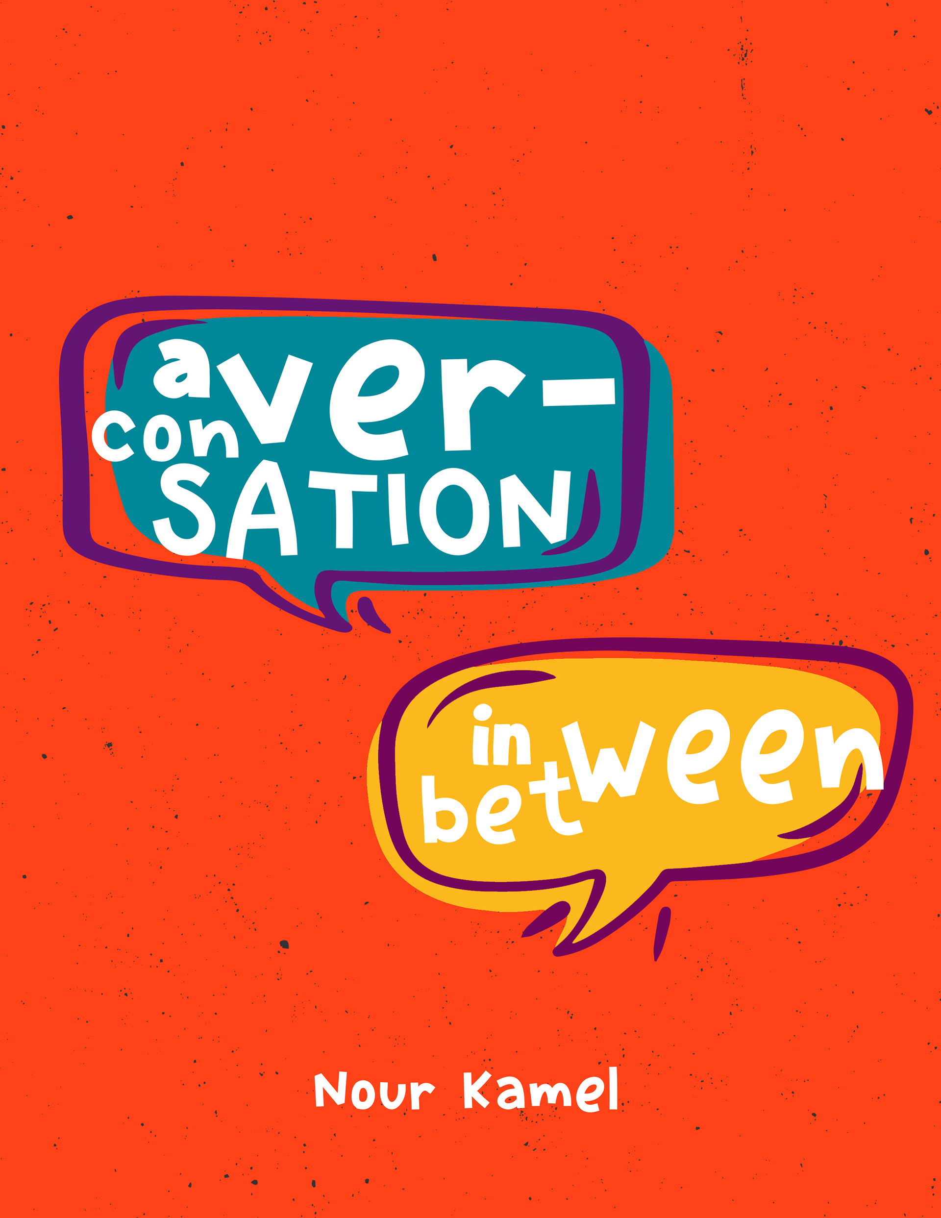
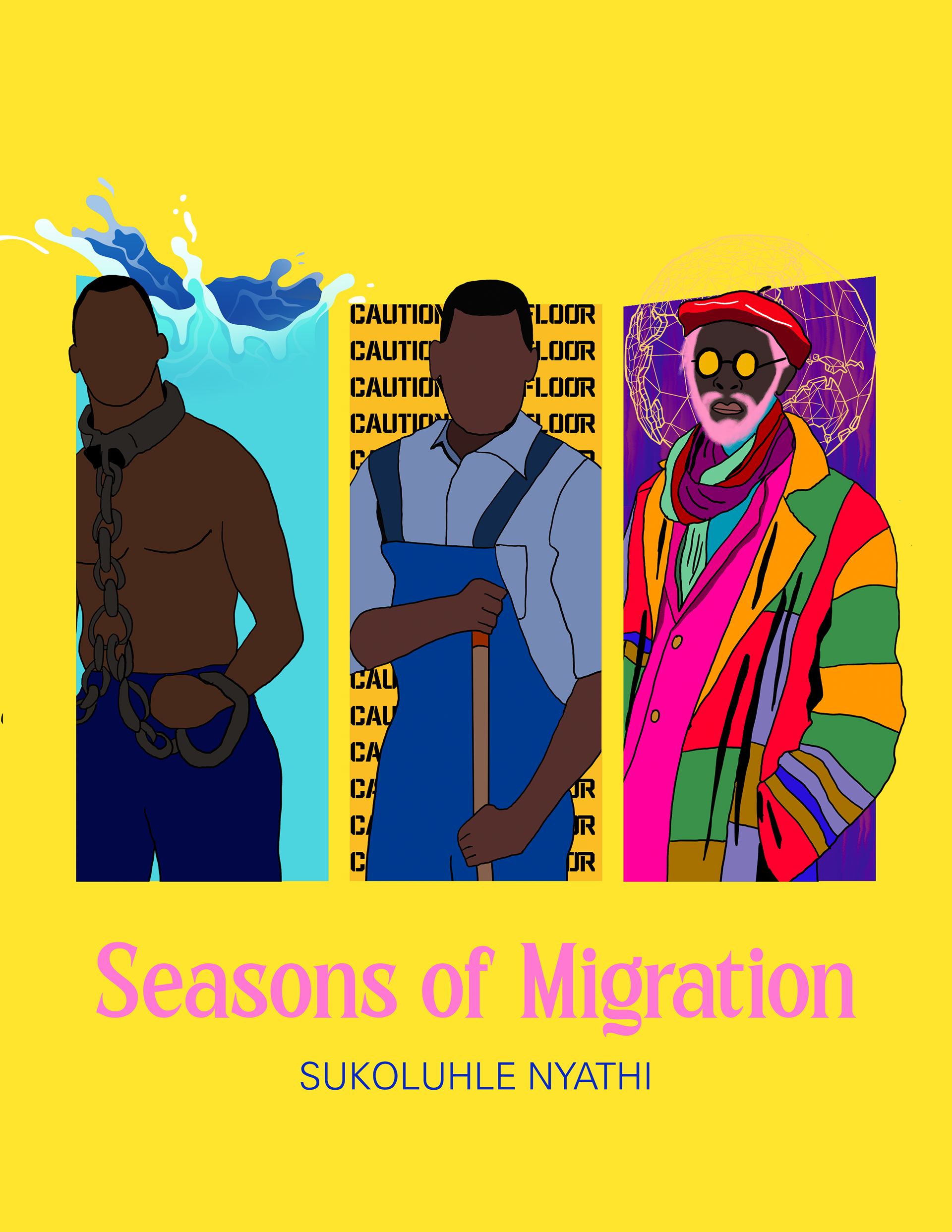
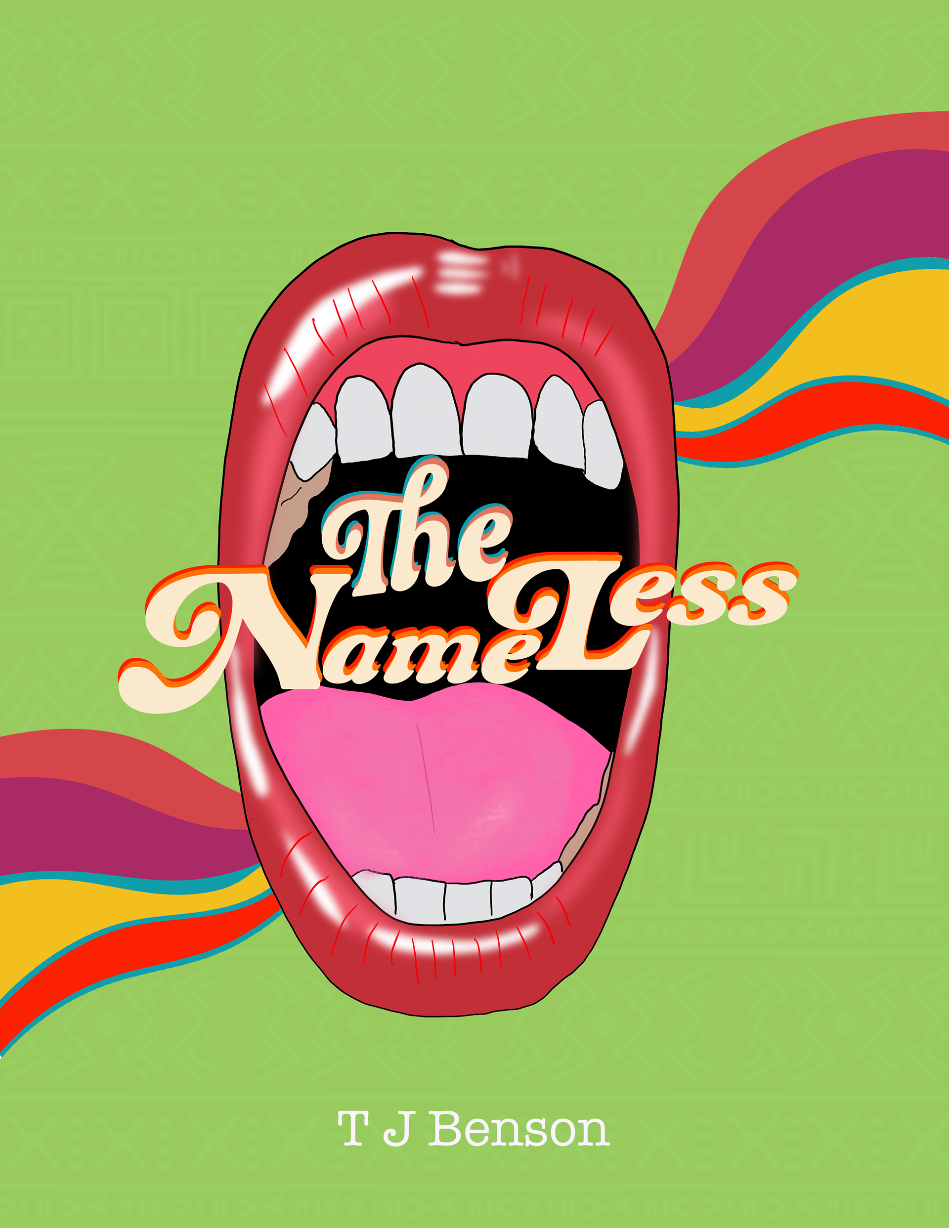
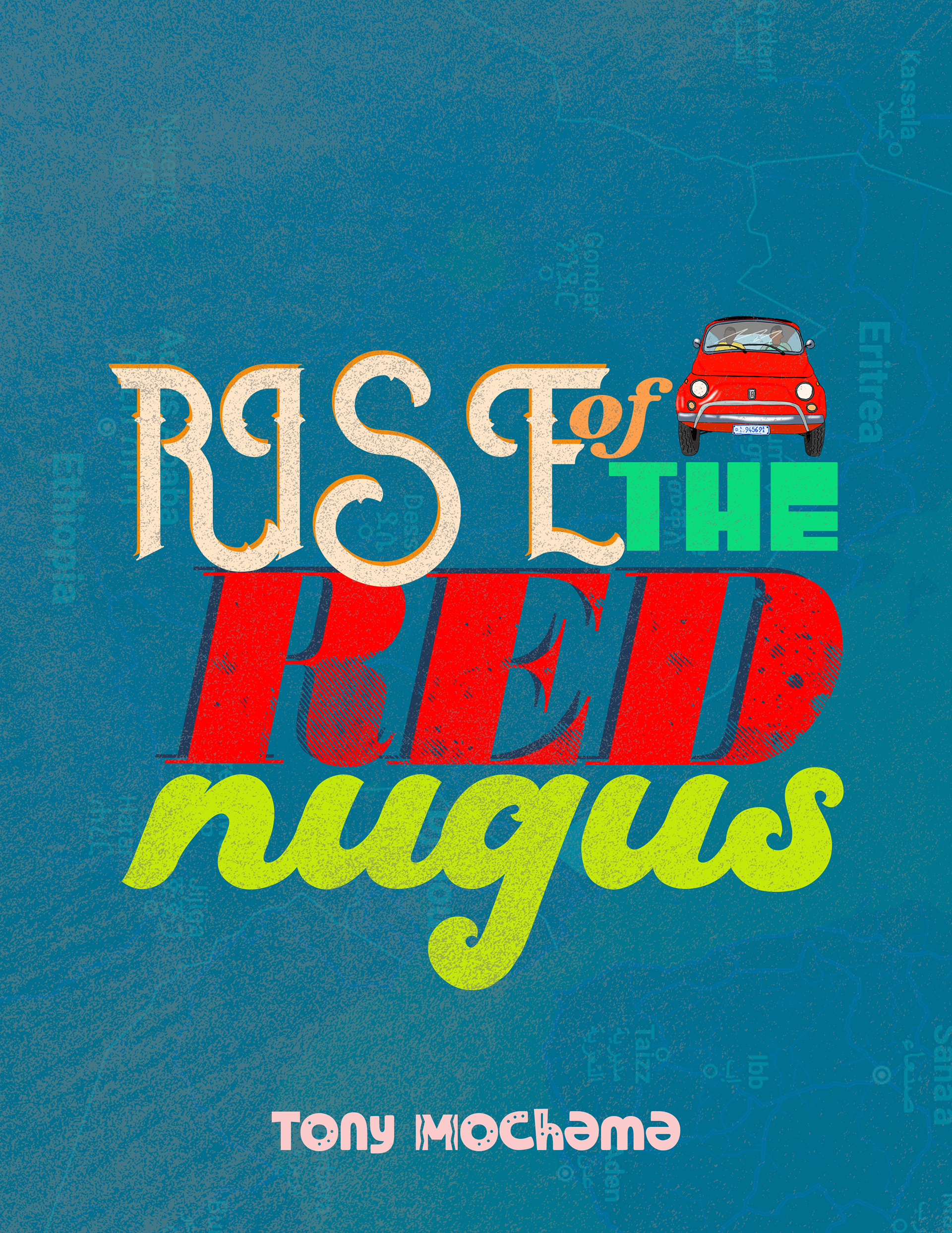
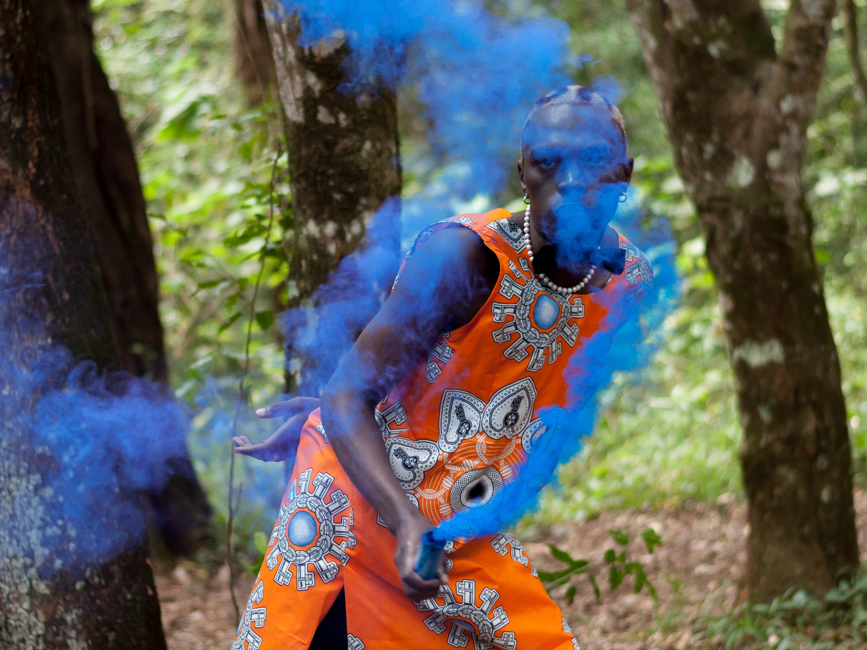
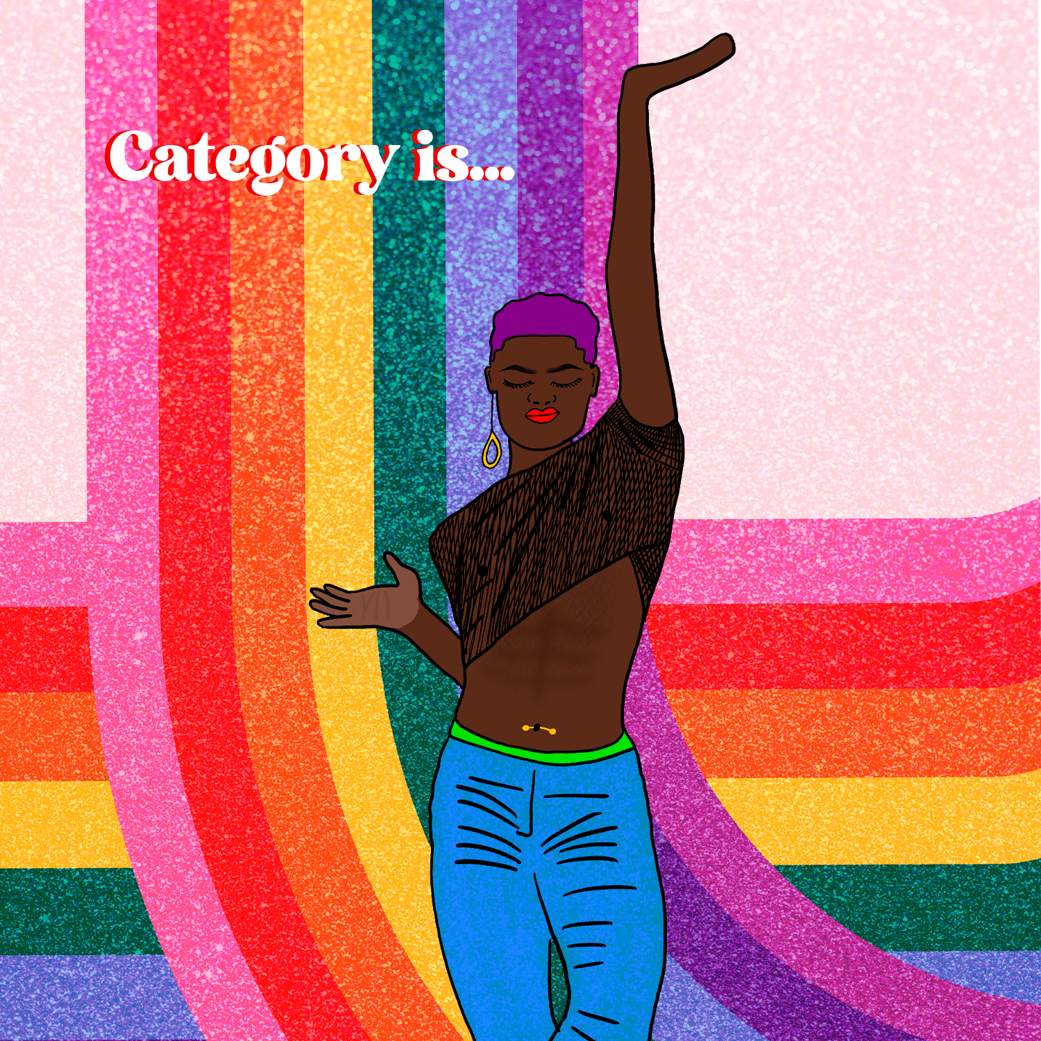
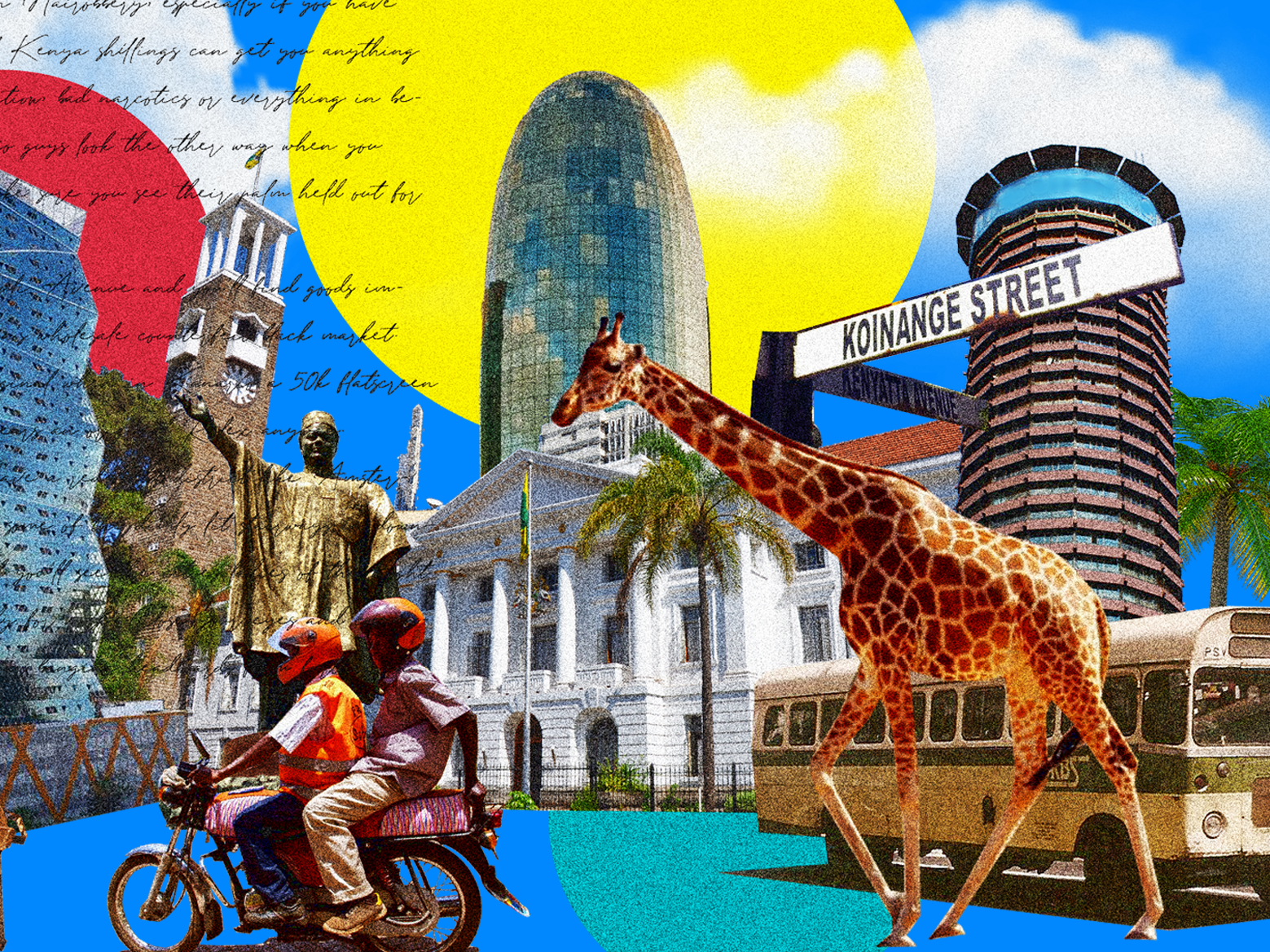
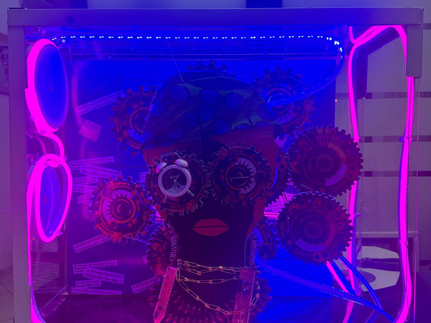
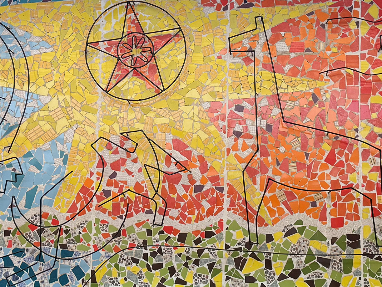
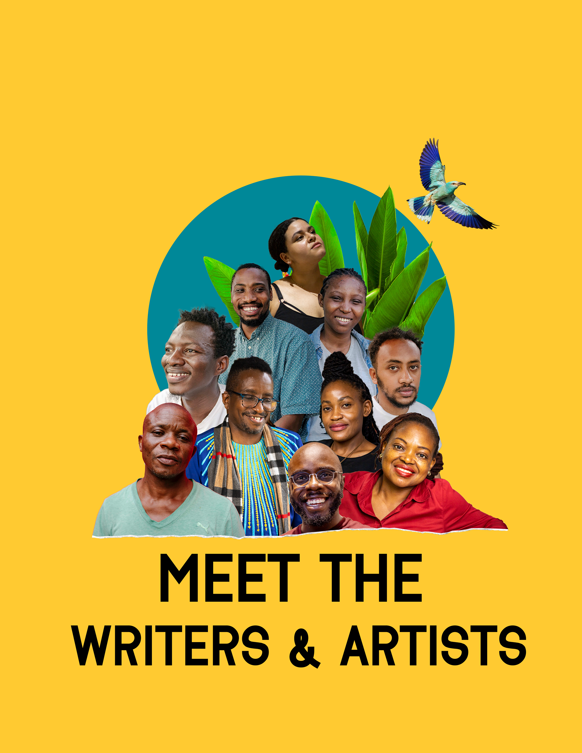
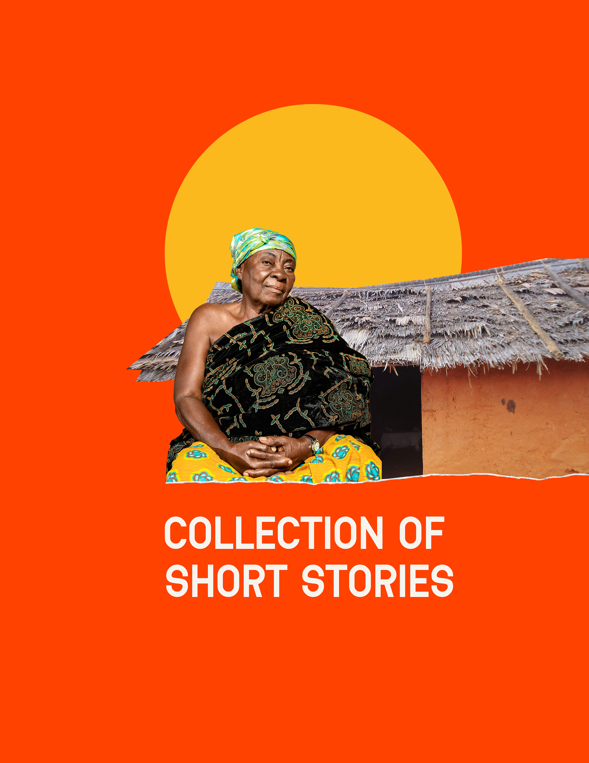
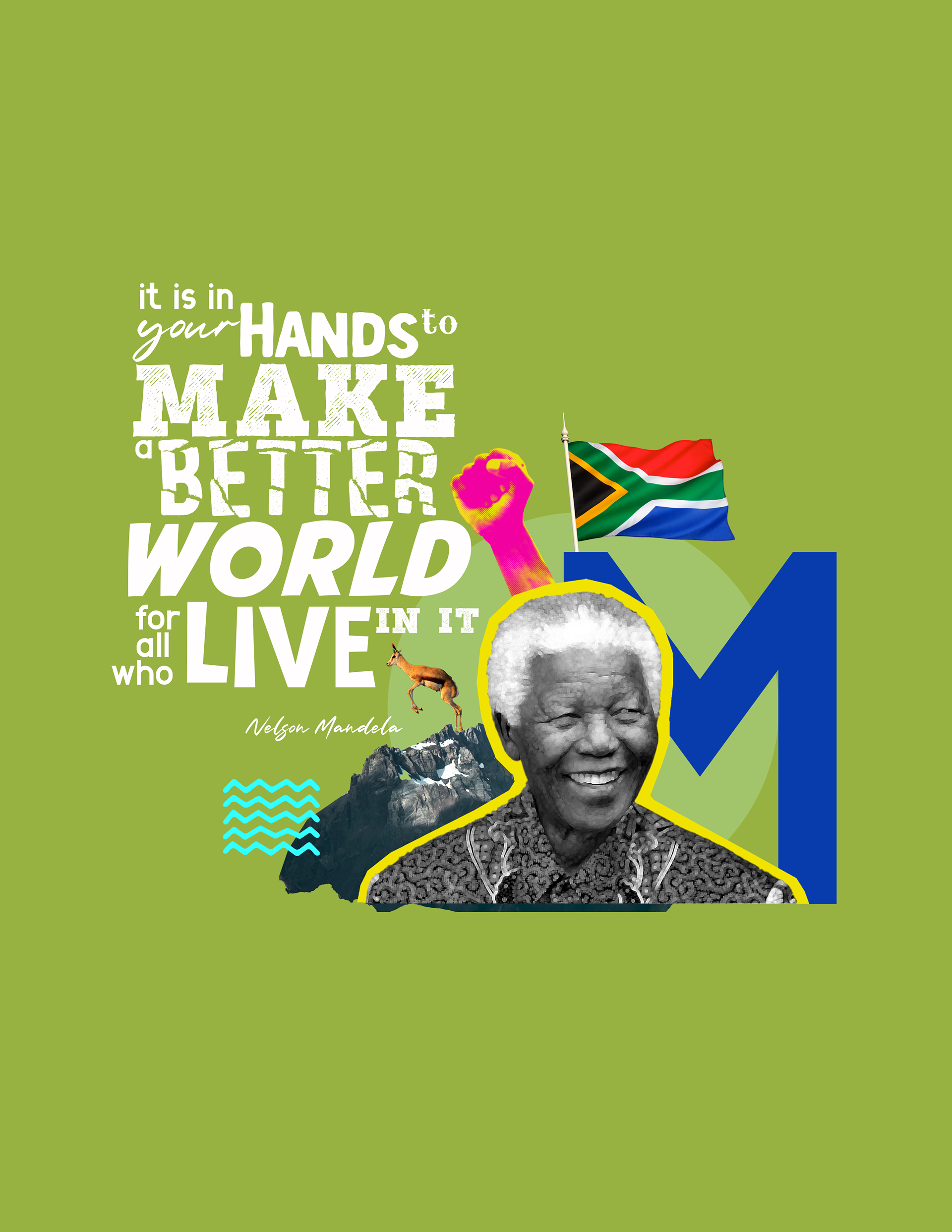
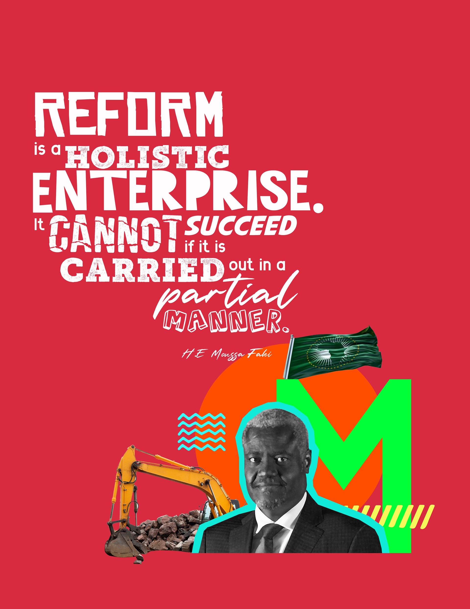
Within the publication, we featured short stories from different writers across Africa, each bringing a unique perspective on the continent’s journey, culture, and aspirations. I was honored to work on the cover designs for these stories, ensuring that each visual reflected the essence and themes of the narratives within.
It was a deeply rewarding process, as I got to interpret the writers’ words visually, using color, texture, and symbolism to complement their storytelling. Every cover became its own standalone piece of art, yet collectively, they contributed to the rich, multifaceted narrative of Africa that the publication sought to celebrate.